

While 85% of Americans get online every day and nearly one in three say they go online almost constantly, you’ll still have to put in time, effort, and planning to get people to come to your blog. There are literally tens of millions of blogs on a range of topics and most site visitors won’t stay longer than fifteen seconds if your blog doesn’t grab their attention.
Your content is naturally the most important part of your blog, but you’ll need to pay close attention to site design as well. A winning design can spell the difference between a winning blog and one that struggles to get attention. What’s more, an outstanding blog reflects positively on your business, showing potential customers that you are a trustworthy professional who can meet their needs and expectations.
Essential Elements Every Blog Must Have
A blog logo is an essential element that defines your business. Blog colors also play an important role in helping visitors see who you cater to, what you offer, and what your core values are. Keep your branding consistent by using the same logo and brand colors not only on your blog but also on your website, social media pages, letterheads, and business cards.
Photos are integral as well. Recent statistics show that images in blog posts can boost blog traffic by almost 100%. Using one photo for every 75 to 100 words of text can double the number of social shares for a post. However, not all photos are equal. Users far prefer unique photos to stock images.
Blog posts must also have a user-friendly layout. Are there a few thumbnails featuring recommended blog posts on similar topics so users who read one post can easily find similar content without searching your blog? Are call-to-action buttons placed in a prominent location? Are sharing buttons easy to see and use? Is the text clear and easy to read? Remember, the end goal of a blog isn’t just to look good but also to bring in customers and generate sales.
Ten Outstanding Blog Designs Worth Learning From
1. MailChimp
Rather than a colorful design with plenty of visual features, MailChimp’s blog is relatively plain. There is ample white space, but that’s a good thing as it focuses user attention on the images accompanying blog headlines. MailChimp uses a combination of unique graphics and photos to highlight post topics, and it’s not afraid to use a bit of humor in its images to connect with customers. Headlines are clear and content of various types and on various topics is listed, so users can easily find something that catches their interest. The handy menu at the top helps users find content on just about any topic.
MailChimp’s logo is featured prominently at the top of the page and throughout the blog, so readers can readily see where the great content is coming from. At the bottom, a large bright yellow strip highlights the “sign up free” button, grabbing attention and bringing in new customers.
2. HelpScout

HelpScout, like MailChimp, has a clean design that highlights content rather than visual effects. Graphic images accompanying blog thumbnails are clear and attention-grabbing and there are video posts listed along with text ones so users who prefer watching a video to reading can find content to suit their tastes.
The blue call-to-action buttons stand out from the white background, making it easy for users to engage with the site. What’s more, the choice of blue for this feature is a smart one, as blue conveys trustworthiness and reliability.
3. Microsoft News
Microsoft is a household name, albeit not as a news source. To this end, the company logo is placed prominently at the top and center of the page to make it easy for users to recognize the source of the curated content. Microsoft uses large colorful images to accompany each news article, a wise move considering the fact that individuals process images tens of thousands of times faster than text. On the top, there is a small yet easy-to-see menu connecting users to Microsoft’s product and services pages.
4. AirBnB
AirBnB’s blog is designed to appeal to hosts; as such, its structure is different from typical business blogs. Colorful images are displayed on a white background, but you can’t see the headline accompanying the post unless you move your mouse on the image.
The menu on the right makes it easy to find content on any given topic. What’s more, AirBnB also lists various languages on its main menu, so hosts from other countries can find content in their language without undue delay.
5. Shillington
Shillington, which describes itself as the “original graphic design Bootcamp”, uses a lot of color and style to draw attention to its content. If, for instance, the site features an article on the great fonts you can use for a blog page, you’ll see a composite photo showcasing many of these faults along with the blog blurb. All images are bright and eye-catching, using multiple colors and styles to make their point. The subscription button at the end of the blog’s homepage is set on a dark purple background to help it stand out from the rest of the page.
6. Ahrefs
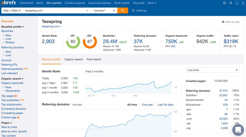
Ahrefs’ choice of font and colors help it stand out as a tech blog. Most of the background is white to give the blog a clean, professional appearance; however, color is used as a background to highlight posts on important topics. The text color for headings is black on white for easy viewing, but dark blue is often used in place of black to highlight individual blog titles. Subtopic buttons are placed under main topic headings so anyone who wants to read more on a particular topic can find specific information.
7. Semrush
Semrush has mastered the art of using color to grab user attention. Thumbnail graphics accompanying blog posts have a bright, solid-colored background, which stands out from the white blog homepage background. Calls to action have their own colorful background to set them apart from the rest of the page. Subtopics are easy to find thanks to subtopic buttons placed under the main blog heading topics, and the top menu can be easily viewed as an individual scrolls down the page. Semrush also adds information about how long it will take to read any of its articles along with each blog thumbnail to users know what to expect when clicking on a link.
8. Grammarly
Grammarly’s clean blog menu layout makes it easy for anyone to pick an article and start reading. Instead of featuring multiple articles on various topics, Grammarly features only seven – one on the top, and two rows with three articles each underneath. The graphics are simple yet attention-grabbing, and the bright background for the subscription box helps it stand out from the rest, and the menu at the bottom of the page provides fast links for downloading Grammarly on a range of devices.
9. Tubik Studio
Tubik Studio specializes in branding and design, so it’s no surprise that its blog is an attention-grabbing success. The images are what stands out the most, as Tubik combines photos with graphic elements to create stunning images site visitors won’t soon forget. The top menu can be viewed as one scrolls down, and the bottom menu features popular tags for those who want to look up a particular topic. Instead of white, a very light shade of gray is used as the background, giving the blog a clean yet warm vibe.
10. Twitter

Twitter doesn’t use a single image on its blog homepage, but the page still grabs attention. How does the company do it? The extra-large font for blog headings makes it hard for users to miss important content. A list of popular tags at the bottom of the page also uses a large font, albeit in Twitter’s signature light blue instead of the dark gray used for blog headings. The company logo is on the top left, and the menu, with white text on a blue background, can be viewed even as one scrolls down the page.
If blog design isn’t your strong point, the visual examples listed above can help you see what a winning blog looks like and empower you to create a unique design that will appeal to your target audience. By combining an attention-grabbing blog design with top-tier content, you will create a winning combination that will showcase your business in the best possible light, generate sales, and built trust in and loyalty to your brand.
Article Submitted By Community Writer