

We all know that mobile phones have become a necessity today. You won’t see anyone stepping out of their house without a mobile phone. Over the past few years, the number of mobile users has increased exponentially, and as it is so handy people use mobile more often to visit a site than the laptop or desktop. Now, Google will also rank websites based on their mobile version. They have made this clear in their ‘Mobile-first indexing’ article. Earlier, they predominantly used the desktop version to index and rank a website.
So, you see how important it is to have an excellent mobile-friendly website. There are certain differences in the viewing profile of a desktop and a mobile. You can test whether your website is mobile-friendly or not using Google Mobile-friendly Test.
The reason for giving mobile-friendliness so much priority is that over half the traffic over the internet is mobile users. If you do not wish to lose them then you must opt for a mobile-friendly website. Here are some steps through which you can create an amazing mobile-friendly website.
1. Make sure your website is Responsive

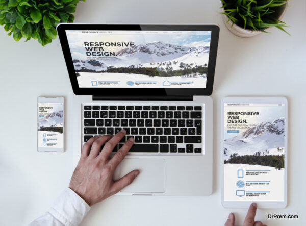
A responsive website adapts itself as per the dimensions of the device with no change in the content. It means that your content should fit the screen. With a responsive website, your users will get the same experience on mobile and desktop. Also, a responsive website is good from an SEO point. The below image will show you how a responsive website looks like.
The above image has been captured through LT browser. LT browser is an easy solution for mobile website testing. With LT browser you can test for mobile responsiveness of your website on 25+ various mobiles and tablets. It also shows the side by side view of websites rendered over two devices of your choice, as we can see in the above image. LT Browser performs debugging on various devices that have different screen size and resolution. The left image is of Galaxy Note 9 and the right-hand side image is of iPad Pro. It is a real-time platform. There are many other features of the LT browser.
2. Focus on the website speed
The loading speed of your website is inversely proportional to the bounce rate. The higher the speed, the less will be the bounce rate (increasing the conversion rate), and with low loading speed the chances of bounce rate increases. Hence, it is necessary to make the loading speed a priority. A Google research has found that on average a mobile user will spend only 3 seconds on a website and if a website is not loading fast, the user won’t waste his time and will immediately switch to another site.
The website loading speed also depends on the network. On networks like 2G, the loading speed is slower than the loading speed in 3G. Therefore, to make your website mobile-friendly you have to focus on the loading speed. It is always better to check your website’s flow depending on your network speed. You can perform this action via LT browser as of this facility.
To increase the loading speed you can use the google recommended plugin – AMP. Also, you should try to compress your images and videos as these are considered to be the heaviest files that take the most time to load. So keep your website simple and minimalist. Yes, simple! No drama. No large and complicated icons. Nothing. Why? Here is your answer.
3. Keep your website simple

The content displayed on the mobile is different from the laptop. Your website should not be too fussy and complex. A complex website will confuse the user. Large and complicated icons look fascinating but having said that we cannot ignore the fact that they slow down the speed of the website.
It should be simple and informative as that will help the user to find what they are looking for easily. It should be designed in a way that automatically fetches the user’s attraction. As we have discussed in the previous step, a simple and minimalistic website will decrease the load time as well.
4. Avoid using Flash
Adobe Flash is computer software that is used to show multimedia content such as animations and videos on your website. Adobe launched Flash in the year 1996 and it was a big hit back then and brought some revolutionary changes.
But now in the year 2020, hardly anyone would like to use Flash. The users needed to download the flash player to use Flash. The biggest reason why no one is in favor of Flash is the security breach. In the year 2011, the CVE reports declared around 63 security flaws and vulnerabilities in the system. It is also not supported on any of the apple devices.
This is why we request you not to use Flash as mobile devices do not support it. So, if your website supports flash then there is a chance that the media box would not load diminishing the overall meaning of the element. Flash is now an outdated service and for mobiles.
Markup language HTML5 is being used for structuring and presenting your content on the world wide web. It is a language that supports Mobile and Laptop as well. So instead of using Flash, you can give HTML5 a chance.
5. Font size and format

While developing a mobile-friendly website you always need to keep the screen size in mind. Laptops and desktops have large screen sizes while mobile screens are relatively smaller. And if the font on that small screen is tiny then the user will have a hard time.
So it is always advised that you should use a large font size for mobile users. Also, you should always use standard fonts. For instead usually, it is recommended that the heading should be 16 points and the paragraph text size should be 2 sizes smaller than the heading that is 14 points.
On using such fonts and sizes you will not need to zoom in or double-tap the screen. To align the images and text you can also use the CSS media queries. Please refer to the below image to inspect. Notice the difference between the font of a mobile device and a laptop.
The above image is taken from the LambdaTest browser called LT browser. You can give it a try for better testing.
6. Add the viewport metatag
How awkward it becomes when we are reading an awesome article on mobile but the screen is not aligned correctly as per the mobile’s dimension. So, now we are scrolling up and down to read the context of the article.
In such cases, you can use – Viewport Meta tags. Viewport basically means the dimensions of the device and also in CSS, is a parameter with the help of which we can calculate the screen dimensions of the device.
When we use the viewport in CSS, the code will calculate the dimensions of the device and will return it to CSS. This is how the webpage is scaled up or down accordingly. The viewport meta tag is used to scale the width of the image and content on the site as per the device’s dimensions. The viewport tag lets the browser to adjust the width of the website as per the user’s device screen.
The code that we can use is:
<meta name = “viewport” content=”width=device-width,initial scale=”1”>
7. Add search bar and navigation buttons

Websites like e-commerce ones have a very huge amount of data and when a mobile user tries to find his desired data, it’s like finding a needle in a haystack.
This is where search bars come into play.
Search bars provide accurate output to users’ search queries. This makes the users experience smooth and painless. You can refer to the below-given image as well.
Navigation buttons should also stand out from the entire content so that in that small display the user can explicitly see those navigation buttons.
Also, adding jump links here and there on your website will minimize the users’ scrolling.
8. Disable Autocorrect for Forms
Autocorrects can make things easier but sometimes they cause problems as well especially while typing your credentials in the form. A form collects all your information and stores it in the database. It is easy to fill up a form on the large screen but what about small screens?
Well, filling up those forms using your mobile phones is a hard task and ‘autocorrect’ adds fuel to the fire. That is why we should always keep autocorrecting off while filling up the forms.
You can turn them off by including autocorrect=” off” in the HTML. Still, if your website contains forms then make sure they are short as long forms can annoy the small screen users.
Also, you can follow the smart approach by breaking a long form into multiple sections. By following this approach the user can easily fill up the forms without realizing that they have filled a long-form. For instance, you must have seen that nowadays survey forms are broken into 3 -5 sections.
9. Beware of the pop-ups

Let’s be honest we all have encountered the pop-ups issue. They are hell annoying. Aren’t they?
Recall the scenario when with our big thumb we click on that tiny ‘X’ button to close those unwanted acquaintances. And how can we forget that horrific scene, when the unwanted pop-ups would interfere in between our user experience and took us to another tab while trying to close that window.
Now the time has changed. Those devilish pop-ups can’t haunt us anymore. Google will penalize you if you try to attempt the following:
- To show a pop-up on the main page of the site.
- To show a full-page pop-up
- To show a pop-up in between the scrolling and exploring of the content of the main website.
In order not to lose your google ranking you must keep in mind that you should have no pop-ups on your site or should have a small one if required. We all have faced this issue that is why we want the developers to eliminate the pop-ups as they push the user to instantly close the website and move on to another one.
10. Prefer the Single-Column Layout
While surfing a website via desktop we can see multiple columns on the screen. It is because of the vast size that the desktop provides. But mobile screens, they are smaller in size. Single-Column layout simply means presenting all the content in single columns. The most common example we can see is the hotel booking sites.
Conclusion
We have now come to the end of this article. We hope you liked and enjoyed this article as much as we did while writing it. Here are a few bonus lines for you. We all know that technology is changing day by day and to keep up with it one must also change one’s perspective. You must keep your website up-to-date and keep on tweaking your site on the basis of new technologies.
We hope that in this Covid phase you and your family are safe and are following all the norms that the government has published in your interest. Be home. Be safe!
Article Submitted By Community Writer