

If you’ve set up your own reseller hosting account and want to get some great mileage out of it, you should consider creating an eCommerce store. Using eCommerce templates, site builders with your reseller hosting account is a good start but you’ll need to focus on the design as well. To give you some ideas of how to design your eCommerce website, here are some great examples to learn from.
1. Hebe
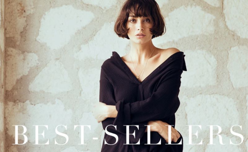
Hebe is a women’s clothing store that has an elegant and clean design. It uses high quality photos for the product pages and beautiful backdrops that reveal themselves as you scroll down the site.
2. Mini + Me
Mini + Me is a online clothing store for babies and parents. The store features strong branding elements, an intuitive user interface, and clean organization of categories. It makes it easy to jump in and start shopping without any fuss.
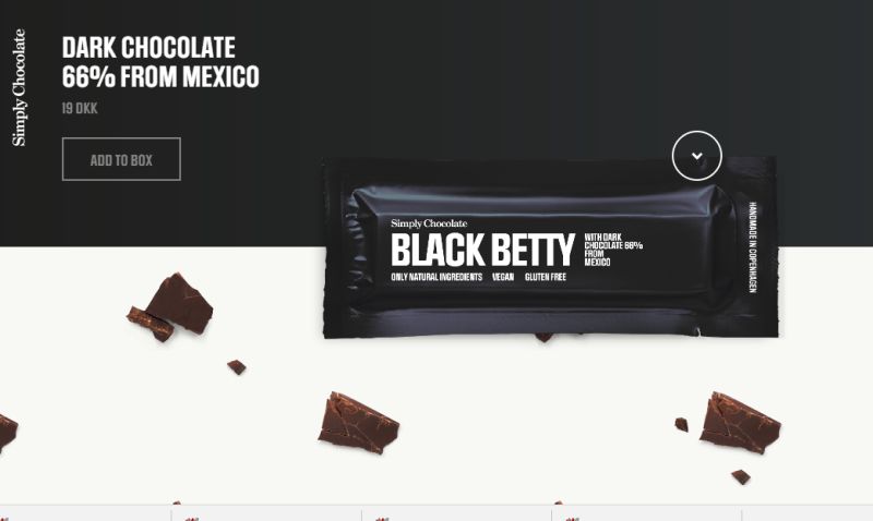
Simply Chocolate is an eCommerce website that focuses on a few simple products. To make these products stand out, it uses parallax, mouse over, scrolling backgrounds, and different backgrounds for each product. The entire experience is all delivered in one page for a one of a kind design.
4. Nordstrom
Nordstrom is one of the biggest clothing retailers in the US. They keep their navigation menu and site design relatively simple and straightforward. However, they make their design stand out by integrating editorial style blurbs throughout the site. This makes their store pop while also providing visitors with helpful product information.
5. Drybar
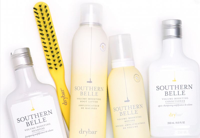
Drybar is a truly one of a kind design. It uses a black background and uses silhouettes icons for its top navigation. The products are laid out with dotted dividers for a cut out feel and it sticks to its strong theme colors – yellow, white and grey.
6. The Practical Man
This men’s clothing store uses a different approach by using a blocky layout that feels like a complex HTML table. Its unconventional design does work because it helps all the individual elements stand out and also because the various elements are clearly organized.
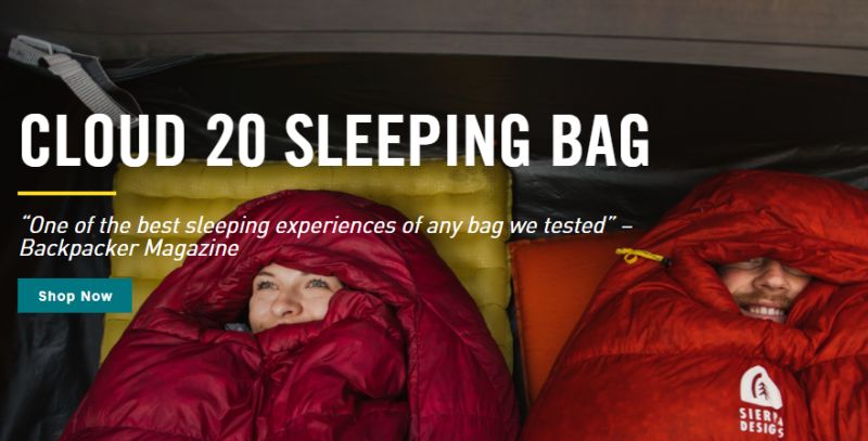
Sierra Designs starts with strong branding elements with their unique logo and drop down menus that reveal examples of their products. These elements are paired with overblown lifestyle photos that signify what their products are about.
8. Bellroy
Bellroy is all about using contrast to help their design stand out. At first glance, it looks like a simple black and white store design. But when you scroll down you’ll see their category links set in various colors to help their navigation stand out.
Talk about playing into the theme. All the design elements including the typography, photos, colors, and backgrounds contribute to the bohemian feel of the design and brand. It’s always a good idea to go back to the original theme rather than trying to reinvent the wheel.
10. Ambsn
Ambsn is a clothing store that sells colorful clothing. To go along with their brand, the company has decided to decorate their website with colorful patterns and unique colors that jump out at you.
11. More Porks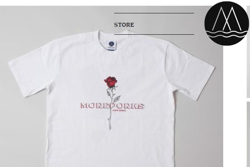
This is another apparel site that focuses on strong branding. The main logo is centered and stays static as you scroll down. That doesn’t ruin the user experience so much as it uses transparency to help you browse their products without any issues.
12. Dainty Jewell’s
Dainty Jewell’s is a women’s clothing line that focuses on elegant and formal wear. The background is designed with polka dots while the colors, backdrop and typography exemplify elegance, class and femininity.
13. Mee Audio
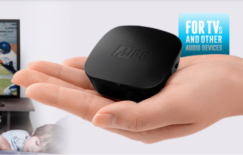
Mee Audio uses a wide variety of layouts to showcase their products and how they’re used. They prominently use video and large sliders to provide their visitors with an interactive and fun experience without bogging down the design.
14. Sidera
Sidera is a company that sells nightscaping products. The company does an amazing job with their website as they use clear and big photos that demonstrate how their products work. Another thing they do really well is using strong iconography and branding elements to appeal to potential resellers.
15. A Book Apart
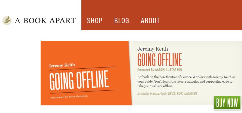
A Book Apart uses very clean user interface for their online store. They sell a wide variety of branded products that are whimsical, fun and targeted to the right audience. Everything is neatly organized and kept simple to enhance the user experience.
16. JM and Sons
JM and Sons sell custom wood furniture. They use real photos of the craftsmanship to help sell the quality of their products. This is a great example where high quality photos can sometimes do all the work for you.
17. Tessemae’s
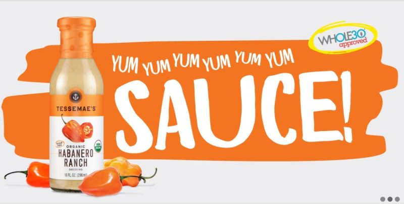
Tessemae’s uses fun and colorful splash backgrounds for their products to make up the design of their site. They sell various sauces, so each product has its own presentation. The product pages are paired with vibrant photos to stimulate your appetite.
18. Kutoa
Kutoa is a supplement bar company that uses powerful storytelling in their design. They back up their products by pairing it up with real ingredients. They also use their events to explain the mission behind their company. A combination of strong photos, branding elements, and a genuine approach bring it all together.
19. Dodocase
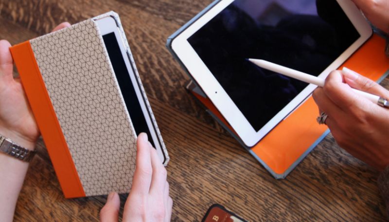
Dodocase uses a vintage color scheme for a rather modern product – the tablet. Interestingly enough, it works because it fits with their branding. They focus on high quality sleeves and primarily sell leather products over cheaper plastic covers.
Au Lit Fine Linens sells bedroom products and stays simple with a white color scheme. However, there are many interesting elements like embedded sliders for product browsing, informational videos, and shelf like displays for links.
21. Di Bruno
Di Bruno Bros. marries a vintage aesthetic with a modern feel. You’ll get the standard deli chalkboard typography but also bright well-photographed images of their food. They put emphasis on space to let each product shine.
22. Hincapie
Hincapie is another great design that exemplifies the lifestyle behind the products. It uses dramatic action photos, a bold color scheme, and a straightforward design. They also embed cycling stories and events for an interactive eCommerce experience.
23. Solo Stove

Solo Stove uses a one-page style eCommerce site that uses multiple elements. It uses a big hero image and follow that up with credibility elements (featured on Backpacker, Huffington Post, etc.). It also uses graphical tutorials of how their products work as well as links to their various products for a very comprehensive landing page experience.
24. Sisu
Sisu sells mouth guards but doesn’t resort to a boring medical type of site. They use bright colors and vibrant typography. They pair this up with different colored products blown up in the center of the page.
25. Press
Press lets their photos speak for themselves. This bookstore uses actual photos of their physical store and rotates them as a hero image. This is followed by beautiful layouts of book covers that reveal their titles when you mouse over.
That’s a run down of 25 great examples of eCommerce designs. But that’s not all. There are also many other engaging website designs like that of Ecom Warrior Academy
. All of these websites approach design from a unique perspective apart from following the principles that determine the growth of an eCommerce business. So whether you want to create a traditional eCommerce site, a single page focused site, or an interactive site, you’ll be sure to find examples to help you.
Article Submitted By Community Writer