

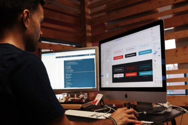
Building a new website can be an exciting time, especially if it is the first one you have set up. It can also be quite daunting, because there are a lot of different factors that you need to consider.
From choosing the right team and picking the perfect domain name and extension, to which hosting provider you’ll use, there is a lot to consider. That’s before you’ve even come to make decisions about your website’s design.
Here are some key factors for the design that you should consider.
Who is Your Audience?

Before you start building or even producing a wireframe, you need to understand who your website will be used by.
You’ll need to adapt the colours and imagery that you use in the design to reflect the interests and needs of the people that will use it. You may also need to consider the computer skills of your audience, particularly if they are older.
For example Reader’s Digest is a website aimed at older audiences. It uses larger font sizes and has a very uncluttered, easy to use design. While Footlocker’s website features a lot of imagery that has been clearly modelled on pop culture, taking inspiration from things like music videos.
How Will People Find You?
As you plan the structure and customer journey of your website you need to start considering how you will promote the site.
While the content of your site will be important for your SEO activities, getting a solid structure that has a logical set of pillar pages and a clear hierarchy will make it much easier to get your content strategy right.
Make it Mobile Friendly
Around half of all web traffic now comes from mobile devices. Google also indexes new websites with a “mobile-first” approach. So it is vital that you ensure your site will work well on a small screen.
Since 2010, the way web developers have achieved this has been through a process called responsive design. This makes use of flexible sizing of objects and a fluid grid to allow the layout to move and fit the screen size.
If you use a content management system like WordPress it’s likely that your theme will automatically be responsive, so there shouldn’t be too much to worry about.
In addition to a responsive web design that works well on mobile devices, you may wish to consider having a mobile app too. This will depend entirely on what you plan your website to do. For example, you will likely want to use an app if you want to send regular push notifications to your users, which is common in chat apps like WhatsApp and Messenger.
You may also wish to launch an app so that you can use native functionality, like full screen or game mode. This is common among mobile games like the PokerStars app, which has almost all of the same features as its desktop version, but in a format optimised for Android.
Other examples of using both a responsive design and an app can be seen in Fintech products like Curve. Visitors to the company’s site are encouraged to sign up, but in order to use its full range of services they need to download the app.
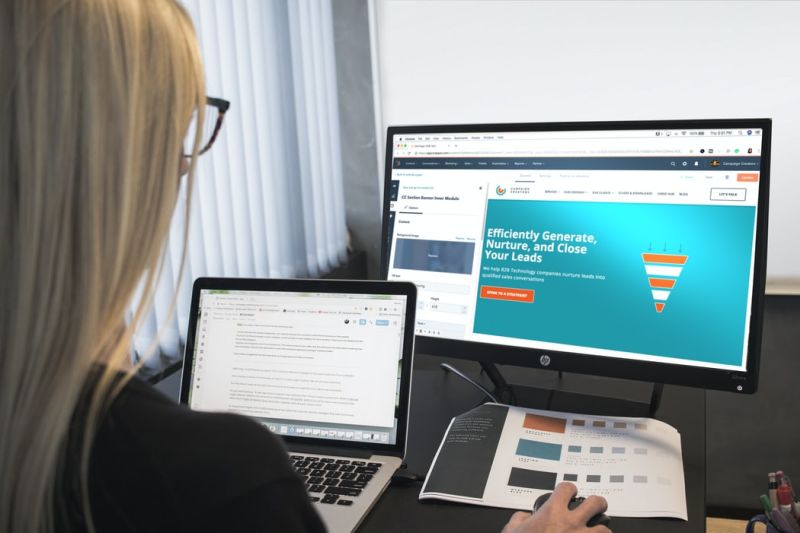
Get the Content Right
You should be planning the content and the design at the same time, as they will both affect the other. You need to lay the content out in a way that makes it attractive and enticing so that users are encouraged to read it in the first place. This can be seen in the fact that research by Adobe has shown that 59% of users want content that is “beautifully designed”.
This will also help to make the key message of your site clear, which is another important element since 46% of users say they will leave a website if it lacks clarity.
Therefore, how you display the content is just as important as the content itself. You may need to consider using imagery to compliment the message, but ensure that it doesn’t clutter the page too much.
Article Submitted By Community Writer